Design with whitespace & confidence
One of the easiest and most overlooked ways to make a site look more “designed” is to use liberal spacing. Always start with more spacing than you think you'll need.
This is 100% true. I typically gravitate toward smaller spacing by long habit, but adding lots more space is almost always the way to go. Everything needs space to breathe, especially on a marketing site.
Whitespace is an important part of the storytelling of a website. It can show separation, add dramatic effect, & moderate the speed at which you perceive elements by changing the amount of scrolling. Whitespace says things your words don’t.
With my web design, I uncounsciously used to be petrified of boring viewers, so I tried to make every section pack a punch, then pack those together. But no matter how beautiful each component is, when all jammed together, they lose effectiveness.
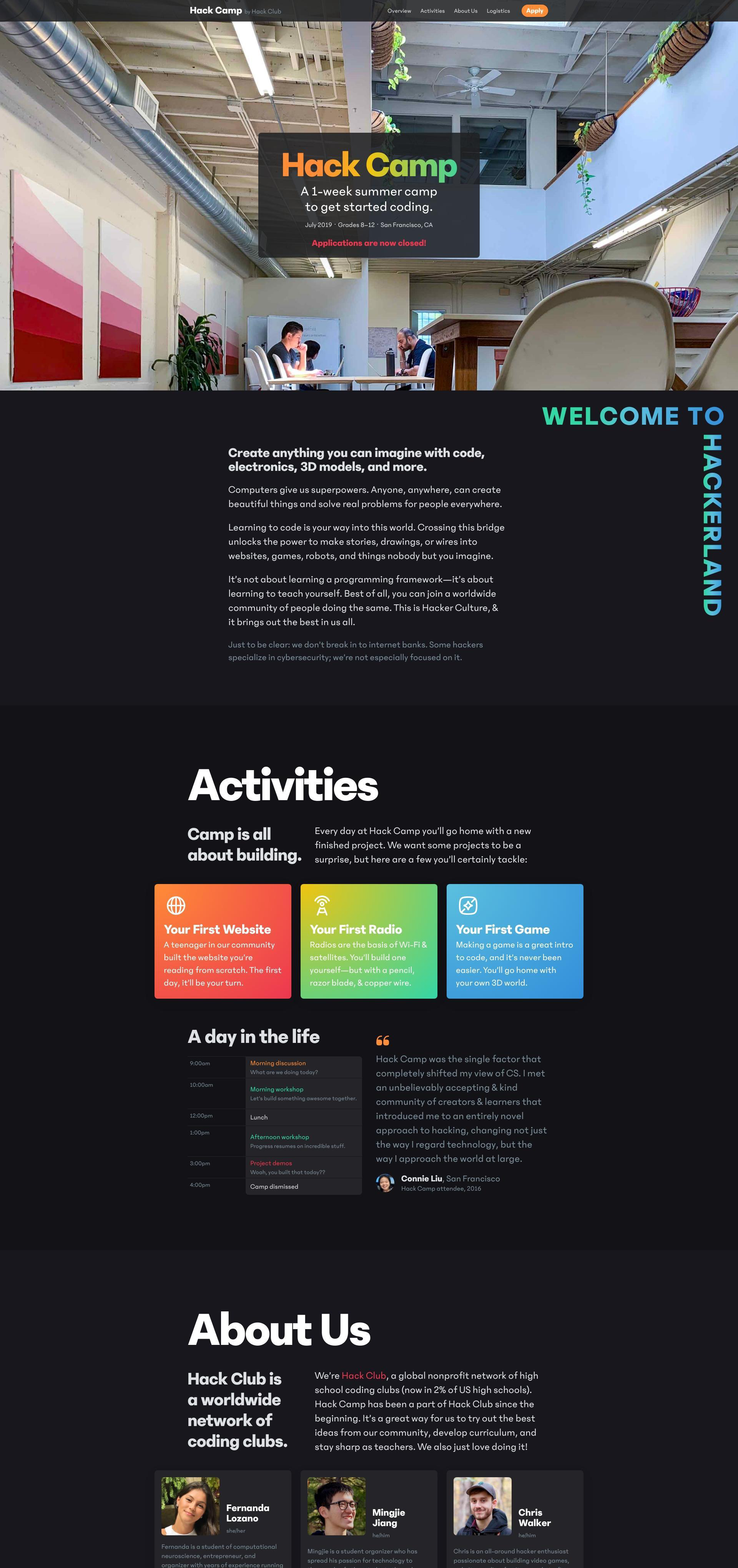
In spring 2019, I made a website for Hack Camp, where I used some of the largest headings & most whitespace (or dark grey space, at least) of any of my designs to that point. When I was designing it, it at first felt like too much, but the hierarchy actually works really well. It does the opposite of boring viewers—it emphasizes what’s important, differentiating with clarity. Whitespace allows drawing focus to the content, instead of drawing focus to general busy-ness in a design.
There can, of course, be too much of a good thing: if there’s too much whitespace, your page can look bizarrely barren & people won’t know where there’s more content. But using generous whitespace effectively, giving elements space to breathe & clear separations where they’re logical, is one of the best ways to make your design shine.