Design & content go hand-in-hand
For truly thoughtful, effective web design, the content & the design must be composed hand-in-hand. On a great page, the design is not just communicating the words, but is supporting them & speaking for itself. This is why CSS templates always end up feeling dull: the content has been fit into a templates set of boxes, instead of building unique boxes with shared characteristics around the content.
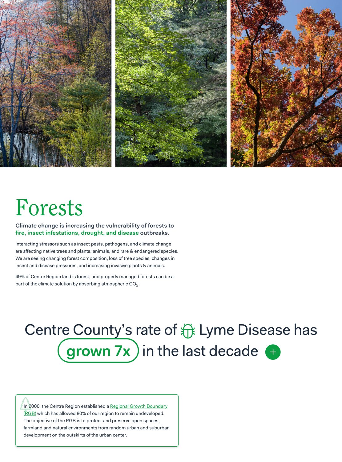
For a recent page explaining local climate change, this especially came to fruition. I realized that even as someone who’s tried to research & understand climate change better than average, I couldn’t explain what was changing about climate in my own town. For most web projects, I need to deeply understand the topic before I can effectively communicate about it; for this project, I wanted to make the page partly to answer my own questions. I was working with Pam Adams, who provided all the research/knowledge & drafts of the writing. We went back-&-forth dozens of times, her writing a first draft of each section, my trying it out on the page & editing it down, her expanding with more information & wording.
While most local government communications end up obscured by bureaucratic language, we aimed for intense clarity & accessibility. As I designed the page, making the content & the design speak together was my greatest challenge. There’s lots of pages with charts of carbon dioxide or lists of effects of climate change; what’s rare is making them communicate something beautifully together.
Making a template for this, interleaving icons with the text & highlighting part of the text like that wouldn’t have occured to me, because no words in “lorem ipsum” stand out to me. Looking at the real statistic, it’s obvious where I should draw attention to.
I also always end up changing the content itself as the design takes shape: adjusting words to change line breaks, moving words so they can be highlighted together. When I’m working with a client who’s written text I can’t edit, it always makes for a worse site in the end.
Reminder: Design is still about words. Drop the lorem ipsum, get some real words in there—even if those words are a draft, you’ll be able to design with a new level of clarity, with much more interesting results.
