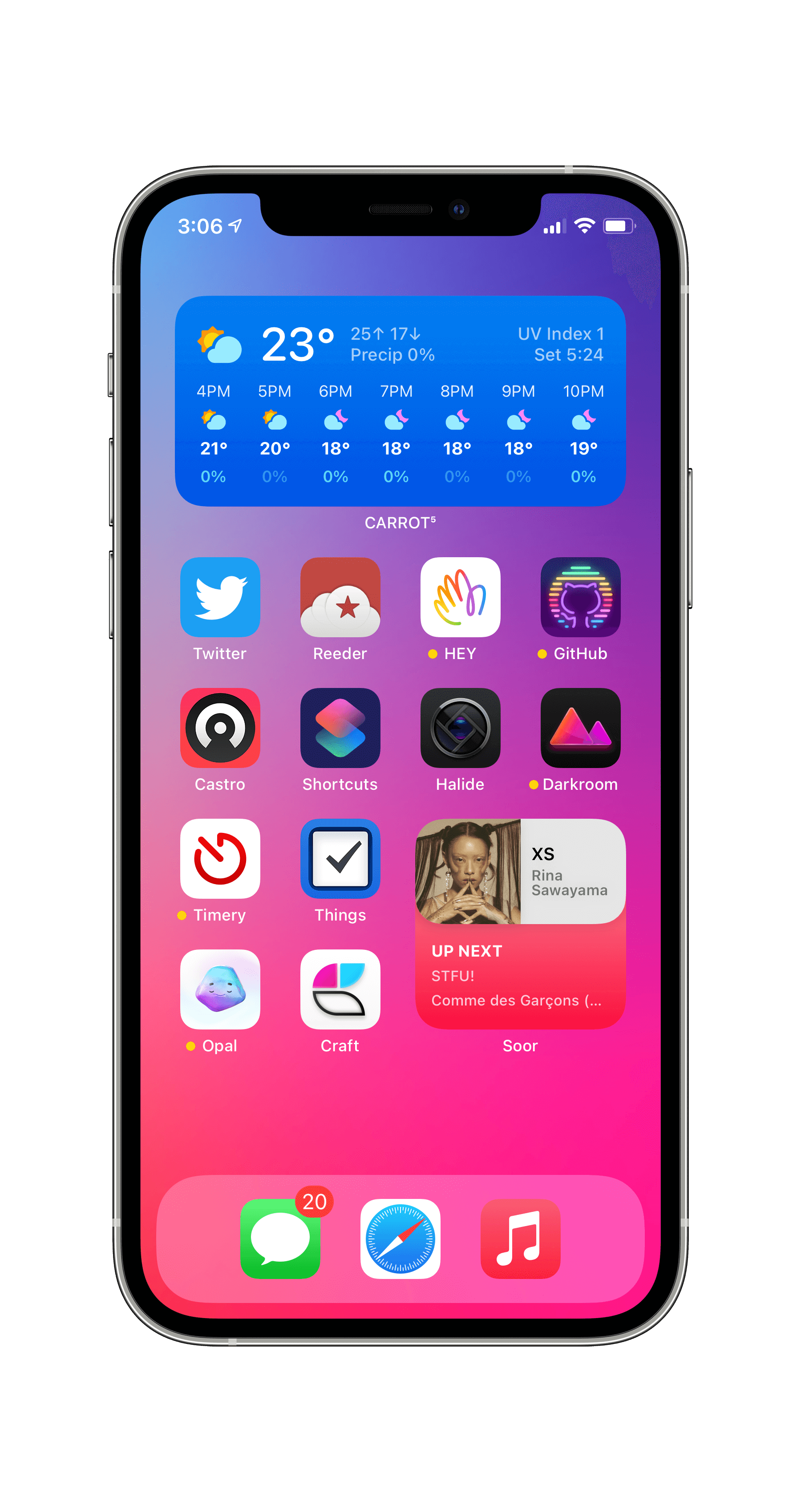
My 8 software subscriptions
Apple One Premier is Apple’s subscription bundle, including 2 TB of iCloud Storage, Apple Music, Apple TV+, Apple Fitness+, Apple News+, & Apple Arcade shared with your family. Since my family already subscribed to Apple Music, News+, & iCloud storage, switching to Apple One Premier reduced the cost, & added TV+/Arcade/Fitness+. I’ve long loved Apple Music, switched a few months ago to syncing nearly all my files over iCloud Drive, enjoy a few shows on TV+, & read News+ several days a week. Though I never use Arcade, as I wrote recently, Apple Fitness+ is my new favorite habit, so Apple One Premier is a great value.
HEY has solved email for me. I’ve long thought I was just too lazy & disorganized to be on top of my email, but using HEY, I discovered it’s more of a tool problem than a Lachlan problem. The manual separation of senders into Imbox, Feed, & Paper Trail make it so much easier to keep on top of emails that are important, while giving a much more pleasant space for scrolling through the numerous newsletters I read. I find Reply Later can easily become a void, but I couldn’t go back to the overwhelming chaos of a traditional inbox after HEY. The widgets are great too.
Password managers are indispensable, & 1Password is the best. It integrates natively with Apple’s keychain, so autofill is seamless, will generate passwords & automatically save them on the Mac, & the family subscription lets you keep your logins privately synced but share certain passwords (like Netflix).
Halide Mark II is my pro camera app of choice for iPhone. Their pricing is totally brilliant—you lock in your price forever when you subscribe, & it will get more expensive over time. Whenever I want to shoot ProRAW, I immediately reach for Halide, with all its manual controls. I wish they’d add a manual white balance control, but the haptic feedback & gestures make it a joy. Darkroom is my preferred photo editor.
CARROT Weather is my favorite weather app out there. (Hello Weather deserves an honorable mention, but I prefer CARROT’s design.) The Apple Watch app is one of my most-used, by far, mostly via its excellent complication, & same goes for its widget. Today’s launch of CARROT v5 brought an even better design.
After about 2 years heavily using Apple Notes, Craft Docs has 100% superseded it for me. I’m planning to write more about my setup soon, but it combines all the best elements of Notion with a super-responsive, super-polished native design. It supports double-sided links/backlinks between notes, nested notes with a ton of styling options, & the simpler structure of the app makes it feel more lightweight than Notion. The super-flexible import/export options also mean it has none of the lock-in of Notion1, while having great features like collaboration & web link sharing. I’m often spending an hour or several a day working in Craft.
Timery for Toggl, for tracking how I spend my work time, is key to my workflow. After first hearing the idea from CGP Grey (listen to Cortex #101 if you’re interested), it’s helped me be a lot more conscious about how I spend my productive time. I only track work time—I don’t track Twitter usage, exercising, etc—but it gives me a log of how I’ve spent my time, & forces me to be more real with myself about how much time I’m actually dedicating to each of my projects. Timery’s widgets are especially standout, & easily some of my most-used on both my iPhone & iPad, & the same goes for its rich Shortcuts support. (“Hey Siri, stop timer” is probably my most frequent request to my HomePod.)
Castro Podcast Player is my newest subscription. After using Overcast since it launched in 2014, I was intrigued to try something with a newer design. Though I miss the Smart Playlists of Overcast, the Queue & Inbox structure I really enjoy, since I felt like a lot of episodes got lost in a long list of shows in Overcast. The features that once made Overcast unique, Smart Speed & Voice Boost, are just as good in Castro, & the design feels fresh.
With the exception of Apple One, where they make sense, all these apps have top-notch widgets, Shortcuts, &/or Apple Watch support. Broader than that, they’re all high-quality, native software, mostly from small indie companies. For tools I spend hours per week using, directly supporting those businesses & the creators of these projects is worth something real to me.
Footnotes
-
Notion’s idea of copying a note as Markdown on iOS is to download a ZIP file, unzip it, then open another text editor, select all, then copy, requiring several round-trips. For tasks like publishing posts to this site, that’s way too much friction. ↩
