Your tools shape your focus
My Apple Studio Display encourages me to sit at my desk and do high-quality work. Since that’s what it’s best at, it’s the intention I bring every time I sit down in front of it. My Apple Watch encourages me, not only through its form factor but software, to be more active, and while staying connected, to not get buried in my iPhone. My bright yellow suitcase encourages me to pack lightly and wander.
Those are products worth investing in; they nudge me toward being the version of myself I want to be. They’re beautifully-designed, a joy to own, and by having them in my space, I spend more time doing what I wish I did.

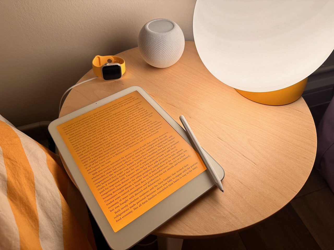
I’ve recently been testing a pre-production Daylight tablet. It’s quickly become a primary device apart from my iPhone in my life, almost entirely replacing my iPad for relaxing at home and reading, plus doing schoolwork and taking notes in my classes. (Note: Daylight provided me this device for free, but didn’t ask me to post about it or say anything specific.)
Unlike an offline-only e-reader, Daylight runs Android, so has enough functional overlap (internet, apps like email) to replace iPad usage without being too inconvenient and making me want to grab my iPad instead. The 60fps display refresh rate sets it dramatically apart from a Kindle or reMarkable as a tablet, with incredibly smooth scrolling. Yet browsing the web on a black & white display is not nearly as compelling; social media feels far out of place on it (I don’t have those apps installed/signed in at all). Its design naturally pushes me to spend quality time reading the writing I’ve selected, or to handwrite on it. The display being reflective LCD encourages me to take it into the sun and read in the park; turning on its amber glow backlight encourages me to journal on it before sleeping instead of watching a TV show. Its non-shiny enclosure never attracts unwanted attention, and I can read on any train or transit with it in peace.
Crucially, after an hour reading on Daylight, not only do my eyes not hurt, but I’m still reading. Without notifications, without all the apps my phone has, without the need to set up complex Focus filters and restrictions for myself to stay on task, I stay immersed in the task I set out to. I remain connected to people trying to reach me through the Apple Watch I’m wearing, but that device never sucks me in. If I want to have a longer conversation than texting on my Apple Watch, it’s a deliberate act to go get another device and do so. I’m not trying to prevent myself from doing anything except the black hole of unintentionality, of letting an hour slip by with nothing to show for it. On Daylight, I added Firefox’s New Tab action to the homescreen instead of a browser window showing whatever I last looked at, which helps prevent accidental derailings.
For consumption, Daylight gives the slower content in my life—books, PDFs, email newsletters—a first-class place. They’re all reachable on my iPad, but social networks are more alluring there. For creation, Obsidian and GoodNotes (the latter paired with an included stylus, which delightfully requires no charging but the back of which erases strokes) handle all my writing. The tablet running Android means many services I use are right there, though it’s also required switching to a few more cross-platform options. (Obsidian Sync, for instance, natively integrates with the file system across all of Android, macOS, iOS, and visionOS, which is crucial for my notes & files.)
I hadn’t realized how much the design of the OSs I’ve long used enable my brain to work against me. On Apple Vision Pro, incoming notifications are designed to be inescapable wherever you look, making the default interaction to open them, and require actively looking/gesturing away in order to not be sucked in. That is the kind of design degrading my attention, making me less effective at doing what I care about. On iPad, turning on a Focus mode that gives me fewer notifications is often not compelling enough for me to remember to do it proactively, only for me to end a session feeling guilty I got distracted.
Daylight has barely any custom software so far on top of Android, besides a mediocre custom PDF reader. Initially, I was skeptical a different display technology was enough of a differentiator; I’ve always used Apple hardware, and most innovations in my workflows have come from new software. But the display’s smooth-scrolling refresh rate, amber backlight, and readability under sunlight make the device fit into my life in a different way than an iPad. Daylight nudges me toward focused work like few products I’ve tried, and the software does everything I need. The focus it gives me has been huge.
All products you use nudge your behavior, often in ways that are hard to tell until you’re without them. I’m not a bad person for not staying focused on my iPad; I didn’t realize how much its design oriented me toward distraction until I tried a tablet without them. I’m not trying to remove all the distractions from my life, either—but if I’m sitting down to focus, I want to stay focused. Daylight is a beautiful product, but what I care about more is how it shapes my work and life.